You'd think centering something on a web page would be simple, but it constantly trips people up. This tutorial examines different methods for centering and the situations they're best used in, because there is no one perfect method for all possible contexts.
Throughout this tutorial, I encourage you to look at the page source and resize your browser window to see how the different examples react to different screen and text sizes. If you're on a phone, try switching between portrait and landscape mode to get different page widths.
For clarity, all boxes used for centering examples will have their content, padding, border, and margin indicated with different background colours. When troubleshooting your own site, your browser's developer tools can highlight a given tag's padding and margin temporarily.
Concepts needed to choose the right kind of centering
Two absolutely fundamental concepts in HTML that you need to know in order to understand what's going on—with centering, but also with a lot of other positioning issues—is the display mode. There are quite a few different display modes, but for the purposes of basic layout, we're concerned with three of them: block, inline, and inline-block.
A block item is one which, by default, a) starts a new line, b) takes up the full width of its container and whatever height is needed to accomodate its contents, and c) may contain other block elements. Things like p, div, and ul are block elements. Some block elements can contain other block elements, such as div and ul. Most can contain inline and inline-block elements, which adds p. The hr element is a notable exception to that: because it's replaced, it doesn't contain anything.
An inline item is one which, by default, a) flows and wraps with the text it's embedded in, and b) cannot contain block elements. Things like em, code, and span are inline items. These are nearly always used inside a block element, for example a p that contains a word or phrase emphasized with em. The text enclosed within any block element is also an inline item.
An inline-block item is treated as inline in that it flows with the text it's embedded in, but treated as a block in that you can set its height and width and it can contain its own internal layout. The img tag is by default an inline-block item. An inline-block element is treated on the outside the way a single word would be, even if it contains multiple words, and wraps accordingly. On the inside however, it's treated as a block, and if it has multiple words in it and its width is constrained, those words will wrap within the item, making it taller and pushing the lines of text it's embadded in apart. MDN has a demonstration of this behavour.
Both block and inline-block let you set height and width. An inline item can have its outline pushed outwards by use of padding, but that doesn't make it take up more vertical space (only horizontal) and will overlap the lines of text above and below.
Centering text horizontally
The simplest and most basic method for centering text is using the CSS text-align property on the tag whose inline content is to be centred. This only works on the content, such as text; the size and shape of the block the CSS rule is applied to is not affected.
This is a simple paragraph using only p { text-align: center; }
here is some text that should be centred
One thing to note is that the content space (green background) takes up the full width of the screen. I've added a small amount of padding that isn't usually in a p tag to make this clear: the centering is not done with padding, when you use text-align.
Centering alongside floats
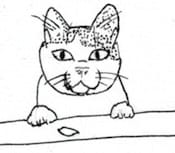
This starts to become complicated as soon as you have any kind of side by side layout, however. For example, an image floated to one side:
Compare a centred paragraph styled as above, with and without a float placed with HTML:
<img src="kitty.jpg">
<p>here is some text that should be centred</p>p { text-align: center; }
img { float: left; }here is some text that should be centred
here is some text that should be centred
and
a
whole
bunch
more
to
reach
past
the
kitty
You can immediately tell that, despite the paragraph block still spanning the full width of the screen, the inline text has been pushed to the right by the image. Note the outline of the paragraph where it passes behind and extends past the floated image. In a case like this, the text is centred in the space left after the floated image uses some of it up.
What's happening here is that text flows around a float—if the text is long enough to be taller than the floated item, any text below it will span the full width of the screen again, and any centering will be accordingly adjusted. The space that text can fill, while beside the float, shrinks, even if the box width doesn't.
If you know that your centred text won't be taller than the float, and you like having it centred in the space remaining beside the float, this is a perfectly good solution. Titles are one example of a good use for this. Keep in mind small screens such as phones, though—those can cause line wraps quite quickly, and push the last word below a small image like this one.
Centering to screen, alongside floats
For short lines, if you want your text centred to the screen, not to the space beside the float, you can add the CSS width: fit-content; margin-left: auto; margin-right: auto; alongside text-align: center; to somewhat sidestep how much the float pushes it over. Remember: the float doesn't affect the margin, border, or padding of the adjacent items! That's why the green content box and the border both reached behind and past the float in the previous example.
Once the text is too long to fit in the space left between the float and the margins, however, it will be pushed over and the centering will again be affected by the float. Long lines or narrow screens have the same effect here.
Compare a centred paragraph with short and long lines, beside a float.
HTML:<img src="kitty.jpg">
<p>here is some text that should be centred</p>p {
text-align: center;
margin-left: auto;
margin-right: auto;
width: fit-content;
}
img {
float: left;
}here is some text that should be centred
here is some text that should be centred
and
a
whole
bunch
more
to
reach
past
the
kitty
here is some text that should be centred and a whole bunch more to wrap the line beside the kitty! Resize your window if this doesn't wrap.
Notice how the green background and also the border are only as wide as the widest line of text. That's fit-content. A floated item complicates this, too! If the space needed to display the item is wider than the space available beside the float, the content block will have that needed width, go behind the floated item, then push the centred text over and cause it to wrap. The image has a bit of top margin so you can see how far the paragraph's block reaches.
Of note, text-align: center; centres the text within the content block, while the combination of margin-left: auto; margin-right: auto; centres the block itself. This lets you do things like have left or right aligned text when the block is centred on the screen (or any combination of alignments), which is useful in many situations. On my personal website I use left aligned text in a centred block to limit the line length of paragraphs for readability, but not have everything over on the left edge of the screen.
Centering without flowing around an image
If you want to have your text centred in the space left after the float is positioned, but you don't want it to shift its centre point once you get below the float, flexbox will do this by creating two columns. See my flexbox tutorial for more information about the flexbox parts of this example.
A two-column example, using flexbox. Note the image is no longer floated, but the paragraph still has its text-align set!
<div>
<img src="kitty.jpg">
<p>here is some text that should be centred</p>
<div>
div { display: flex; }
img { object-fit: contain; }
p {
  text-align: center;
  flex: 20em;
}
here is some text that should be centred
and
a
whole
bunch
more
to
reach
past
the
kitty
Because this uses flexbox instead of float, the image and the text now each have their own column, and the block holding the text does not reach behind the image to fill the entire width of the screen. This does leave empty space above and below the image, which is ideal if you want to have a sidebar.
If there is a third column, the centred text will be aligned within an even smaller width, and again centred with respect to its immediate container, not with respect to the page.
Centering images by themselves
Images by default have display: inline-block; which allows them to be placed in a paragraph with text. This can cause problems if you forget that! If you want to centre an image by itself, the first thing you have to do is use display: block; to change that. Once that's done, setting the margin will work just fine.
<p>here is some text that should be centred</p>
<img src="kitty.jpg">
img {
  display: block;
  margin-left: auto;
  margin-right: auto;
}
p {
  text-align: center;
}
here is some text that should be centred
Centering images in the text flow
Now if you want the image to be inline with the text, that's also possible! Leave the image styling alone, and put the tag inside the p with the text.
HTML:
<p>here is some text and a <img src="kitty.jpg"> that should be centred</p>p { text-align: center; }here is some text and a that should be centred
This does not, of course, guarantee that the image will be centred, only that the text containing the image will be centred. It also tends to look goofy if your image is too much bigger than your text, as it is here, but it's useful for emoji-sized images.
Centered text over a centred image
Another option is to have text overlaying the image; this is popular with sites that like to have a giant banner image across the top of the page. If the image is big enough, you don't have to centre it, so much as set its width to 100% and let it take up the entire top of the page. But if it isn't quite that big, and you want some space on either side, the auto margins will do the job nicely. For the text overlay, try using a negative margin-top on the text:
HTML:
<img src="kitty.jpg">
<p>kitty!</p>p {
text-align: center;
font-size: 1.5em;
font-weight: bold;
margin-top: -67px;
}
img {
display: block;
margin-left: auto;
margin-right: auto;
}kitty!
Obviously the exact size of that negative margin will depend on both your image and your text, and how they play together. That will take some trial and error; I recommend changing the value in your browser's developer tools until you have something you're satisfied with, then putting that in your CSS. (Don't forget to resize your window and zoom in and out to check for its responsiveness!)
Text overlays can also be done with absolute positioning instead of margins, but that's outside the scope of this article.
Centering things vertically and horizontally
Vertical centering is trickier than horizontal—in no small part because the narrower your screen is, the more lines a given piece of text will take up! In the past, the only way to do so was to use a table for layout, and the vertical-align CSS property. There are more options now, though they won't work on many old browsers.
Using fixed margins or padding
While margin:auto worked for left and right aligning things, it doesn't work for vertically aligning. You can use margin or padding, but they have to have a value set, something other than 'auto'. There is a trick to this, of course; if you only set a percentage, it uses the width percentage, even when setting the vertical padding or margin.
This uses both margin and padding to demonstrate centering.
HTML:
<div>
  <p>here is some text that should be centred</p>
</div>div {
padding: 5vh 5vw;
}
p {
margin: 10vh 10vw;
text-align: center;
}here is some text that should be centred
You can see that the div padding (blue) is equal top and bottom, as well as side to side; likewise the p margin (yellow). The units vh and vw are percentage of viewport (the browser window) height and width respectively; this lets it adjust based on your screen size.
I recommend putting padding on the outer container; that way you can have multiple paragraphs, images, or whatnot in that central space. Unless of course you only have one item that you want to have centred!
One limitation of this method is that if you're using the entire window but your text or image content isn't long enough to actually fill the space available, it will be at the top of its centred space. The flexbox option described below will centre your item no matter how big it is, at the cost of having a wrapper. On the other hand, the padding method can be used directly on the body tag.
Using flexbox
One easy way is by using flexbox; that has methods to align things both vertically and horizontally: align-items and justify-content. In the example below, the flexbox container div has been given an arbitrary height of 10em; you can set that to whatever height you want it to centre within, including 100vh for the height of the entire viewport (window).
HTML:
<div>
  <p>here is some text that should be centred</p>
</div>div {
display: flex;
align-items: center;
justify-content: center;
height: 10em;
}here is some text that should be centred
This applies just as easily to images as it does to text, because it's operating on the block-level element p and not the text inside that element, the way text-align does in the examples above.
Notice that the p is tightly fitted to the text; the text-align property is not needed when using flexbox for centering. If you want to have multiple paragraphs, or a mix of elements, I'd suggest wrapping them in yet another container div, so you can format everything inside that container as you like, then centre the whole block of it as a unit—otherwise, it will treat each paragraph as a separate flex item. A paragraph long enough to wrap will still need its text-align propery set as above, if you don't want it to be the default left-aligned on the new line.
Using absolute positioning
Another method uses absolute positioning; this is useful if you know how big the item to be centred is, for example an image. The image in the example below is 170x150px; the margins in the CSS are half that, or 85x75px. What's happening here is that the top left corner of the image is positioned exactly at the centre of the container (in this case the example div, but you can use the body just as easily) then the top and left margins are set to negative half the images height and width, so the image ends up centred on the centre point of the container.
HTML:
<img src="kitty.jpg">div {
position: relative;
height: 20em;
}
img {
position: absolute;
top: 50%;
left: 50%;
margin-top: -75px;
margin-left: -85px;
}For this example, I set the div containing the example to an arbitrary height of 20em, and I also set it to have position: relative. This is because something with position: absolute will position itself relative to the window if it doesn't have a parent element with a position. If you want that image positioned relative to the window, you don't need the positioned parent element.
There are other methods for centering things, of course, some of them more esoteric than others. This should cover a lot of the use cases you'll encounter when building your own website.
Other resources
CSS Tricks has a very comprehensive guide to centering, with even more methods than described here.
Sites referenced in the article
- MDN: Browser developer tools
- MDN: Live demonstration of block vs inline-block.
- Introduction to Flexbox is my previous article in this series.
varve started webweaving in the mid-'90s, and posted their first HTML tutorial online when CSS was a fancy new technology. They enjoy making things work, whether designing industrial wastewater treatment for pay or coding up a website layout generator for fun. You can find them at write-on.org.
Member comments