
Throughout this tutorial, I encourage you to look at the page source and resize your browser window to see how the different examples react to different screen and text sizes. If you're on a phone, try switching between portrait and landscape mode to get different page widths.
For clarity, all boxes inside a flexbox container will be outlined in red.
How to think about flexbox
Flexbox is a "1-dimensional" layout system. Much like a sentence has one "direction", from start to finish, it can be wrapped across multiple lines while remaining fundamentally one-dimensional. Flexbox can seem two-dimensional, because each flex item (or "word" in the flex "sentence") can be quite complex and contain things laid out in the other direction (column vs row), but each flex container can only be one dimension. If you need a two-dimensional layout system, you need CSS grid.
Setting up flexbox
At its simplest, flexbox has two parts: a container, and however many items you want to put inside it.
<div class="flex-container">
	<div>some content</div>
	<div>some content</div>
	<div>some content</div>
</div>.flex-container { display: flex; }Without the display: flex instruction, each of the div blocks inside the container would start a new line. It's important to note that the flex items don't actually need any special styling to behave as flex items! It's enough that they're direct children of something with display: flex. They don't have to be div blocks if you want something else.
Here's a bunch of random elements stuffed into a flexbox:
A paragraph of nonsense, lorem ipsum etcetera.
A div containing two paragraphs.
This is the second paragraph.
 And some text that isn't inside an element, just plain text directly inside the container div, after the drawing.
Notice that the text without an element is treated as one item, not one item per letter, or word, or what have you. HTML considers stuff like this to be a "text node", which is every bit as much a node as each HTML element is. The text node ends when something that isn't text (an HTML tag, a comment, etc) appears. Because that node is inside the flex container, it's treated as a flex item, same as the three child tags <p>, <div>, and <img> (which are also nodes).
Notice also that the top (and bottom) borders of the <div>, the <img>, and the text all by itself line up, the top border of the <p> does not—but the text of the paragraph and the div container paragraphs line up at the top. This is because <p> tags by default have a margin top and bottom. If the <p> has the border, the margin is outside of that (making the top border lower), but if the <div> has the border, the margins of the <p> are inside the border, pushing the text down. Flexbox respects the padding and margins of the boxes it's flexing, which can sometimes lead to unexpected effects like this. Your browser's developer tools has a way to visualize where the margin, border, padding, and actual content are.
A special note on images: when you stretch and shrink a flexbox that has an image as one of the flex items, you might see the image get squashed or stretched all out of its natural aspect-ratio. If your image isn't a solid colour being used to fill space, this probably isn't what you want! To stop that from happening, I used the object-fit: contain CSS property to maintain aspect ratio and allow empty space around the image if the box it's flexed into is a different shape.
flex-direction
The flex direction sets whether things are wrapped by row or by column, and the direction within those. The default is flex-direction: row which is what you saw above. The four possible values are:
row(default)row-reversecolumncolumn-reverse
A flexbox with flex-direction: row:
A flexbox with flex-direction: row-reverse:
A flexbox with flex-direction: column:
A flexbox with flex-direction: column-reverse:
One thing to be cautious with when using one of the -reverse options, is that people who use screen readers will read things in the opposite order you wanted them displayed in. Similarly, people who use keyboard instead of mouse to navigate your page will find their focus in an unexpected spot. There is a use for it still; see the responsive columns example at the end of this article for one of those uses. In general, unless you have a specific reason for sighted visitors and screenreader-using visitors to experience your site in a different order, you're best sticking with row or column instead of their reverse options, and putting things in your page source in the same order as you want them displayed.
Stretch and shrink
Stretching and shrinking is one of the fundamental features of flexbox, beyond even the normal flexibility of plain HTML. One of the interesting things you can do with flexbox is have your columns stretch and shrink at different rates; with regular HTML/CSS you can set minimums and maximums and percentage widths to have them scale to the screen, but you can't have two things side by side that both grow or shrink at different rates.
The CSS properties you use to control this are:
flex-basisflex-shrinkflex-grow
These are often written in shorthand using the flex property, but I will be treating them separately here.
flex-basis
This is effectively the "starting point" for your flex items' sizes. When flexing in the row direction, if you set the grow property to zero, or use only flex-basis instead of the flex shorthand, they won't try to fill the width of your screen. Without setting a basis, the items widths are based on the width of their contents, as seen in Setting Up Flexbox, above. When flexing in the column direction, being blocks, the items take up the entire width of their container (or your screen), and the flex-basis becomes their default height instead.
Here are three boxes of fixed width:
Here are three flex boxes with those same measurements as their flex-basis in the row direction:
And here are three flex boxes with those same measurements as their flex-basis in the column direction:
An interesting thing to note is what happens when your screen isn't wide enough to show all three (row direction) boxes in a single line! Go ahead and resize your browser window to see. The three fixed-width boxes will wrap as if they were each a word; the flex boxes will shrink so they stay on one line. They will not, however, grow unless you set the flex-grow property—the 20% box might look like it's growing, but it changes with respect to the width of the screen, separately from the flexbox size changes. Likewise, if your screen is wider than the basis, the 20em box will change width if you zoom your text, separately from the flexbox size changes.
On the other hand, the columns don't change their basis-derived heights based on the width of the screen—and the flex-basis: 20% item doesn't act as if you set a flex-basis at all.
Try it yourself: set the flex-basis of the three flex items in any CSS units you want, and see how it goes!
Set the flex-basis and width of the three boxes:
Here's another interesting thing to look for: what happens when the width of the box is smaller than the width of the content? Try setting the flex-basis of one of the three boxes to something very small, and you'll see that the fixed-width box will shrink smaller than the text, while the flexbox won't go below the size of the text it contains, even as you shrink your browser window and the larger boxes shrink to fit. If there are multiple words, they'll wrap inside that box, and the box will shrink to the width of the longest word—as narrow as it can get.
flex-shrink
As you saw above, row-oriented flexbox will shrink its columns automatically when the window isn't wide enough to fit everything at its basis size. By default, the flex-shrink setting is 1, which means each item shrinks in proportion to its size, to the minimum that will still display the contents of the item. If all the flex-shrink settings are the same, no matter what number that is they may as well all be 1; flex-shrink comes into play when you want different things to shrink at different rates.
Three boxes with a flex-shrink of 1:
Three boxes with the same flex-basis and different flex-shrink settings:
Resize your browser window to see that the third box shrinks substantially faster than the first two, in the second example, until it reaches its minimum size—which it does first. You can also set flex-shrink to zero for one (or more) of your items if you specifically don't want them to shrink at all. Give it a try below:
A flexbox with flex-shrink: 1 on all items:
Set flex-shrink for the three boxes:
See what happens when one of the boxes has a flex-shrink of 0, compared to the others, or when the item with the largest flex-shrink value gets shrunken down to a box barely big enough to hold the number.
flex-grow
Like flex-shrink above, this property is mainly useful when different flex items have different values, although it also serves the simple purpose of filling the width of a screen. If you set flex-basis as above, then flex-grow is 0 unless otherwise specified; things won't grow. If you set the flex shorthand without specifying a grow parameter, it defaults to 1.
A flexbox specified with flex-basis:
A flexbox specified with flex, using the same basis values but no grow or shrink properties specified:
As you can see, if your screen is wider than the items in the first sample, the second sample expands to fill your screen. If your screen is narrower than the items in the first sample, both of them shrink in exactly the same way: they both have flex-shrink of 1, the default for both cases.
flex-grow is much simpler to calculate than flex-shrink, because it doesn't need to take into account the size of the item contents! If there's extra space, it simply distributes it between the flex items according to their flex-grow setting. If they're all set to 1, the extra space is divided evenly. In the example above, because there are three items, the extra space is divided into three equal parts and each item gets that much extra width.
For example, say the screen is 300px wider than the flexbox at its basis size: if all three have flex-grow: 1, each item would get an extra 100px. If the items have different flex-grow settings, for example if one of them is 2 while the other two are 1, the extra space will be divided into four extra parts: 2 + 1 + 1. The item with flex-grow: 2 would then get two of the parts of extra space, while the other two would get one part each. So, if the screen is the same 300px wider than the flexbox, the four parts would be 75px each; one item would get an extra 150px while the other two would get an extra 75px each.
A flexbox with flex-grow: 1 and flex-shrink: 1 on all items:
Set flex-grow for the three boxes (flex-shrink: 1):
When the window is smaller than the 'natural' size of the flexbox (based on flex-basis, or the contents if that's not set), flex-shrink is the setting in use. When the window is larger than the 'natural' size of the flexbox, flex-grow is what's used. If you set them the same, the growing and shrinking behaviour won't change above and below the 'natural size, apart from the minimum required to fit the content.
Wrap: for when shrink isn't enough
Of course, shrinking your columns down until they're impractically narrow isn't always what you want. This is where flex-wrap comes in. Recall the flex-basis example, with the fixed-width blocks, and how they wrapped instead of shrinking? You can make your flex items wrap, and control when, how, and in what order they wrap vs. shrinking, using the CSS property flex-wrap.
flex-wrap
To turn wrapping on or off in general, you use the CSS propery flex-wrap. Imagine the word-wrapping you get in a paragraph, but each child node of a flexbox, no matter what HTML element (or text node) that is, is a "word" and the flexbox wraps on "word" boundaries to create new lines as needed. By default, flex-wrap is set to nowrap, which is the behaviour in all the examples above. There are two other options, wrap and wrap-reverse. For languages where the start of a document is at the top and flows down the page, wrap puts the next line below the first; wrap-reverse puts the next line above the first, while still displaying things in the same left-to-right (or right-to-left if that's your writing system) order.
The three reverse settings, wrap-reverse, and the flex-direction options row-reverse and column-reverse, each reverse a different direction. row-reverse and column-reverse reverse the direction each row or column is built in; wrap-reverse reverses which direction the next row will be placed in.
A flexbox with flex-wrap: nowrap and flex-grow: 0 and flex-shrink: 1 (defaults) on all items:
A flexbox with flex-wrap: wrap and the same other defaults:
A flexbox with flex-wrap: wrap-reverse and the same other defaults:
Notice how the flexbox wraps the items before shrinking them, if it's allowed to wrap, and only shrinks them once they're the only thing on the line and still too wide to fit. If you allow the flex items to grow, however, they wrap first and only then items on each line grow to fill that one line, as shown below.
A flexbox with flex-wrap: wrap and flex-grow: 1:
Compare this one to the middle example above; which flex items are on which line stays the same, but how wide they are can be extremely different, especially when that last flex-basis: 150px item is on a line by itself.
Many people use the shorthand property flex-flow to set flex-wrap and flex-direction at the same time. You can actually wrap columns! You just have to explicitly set the height of the container to something shorter than all the items:
A flexbox 600px tall, with flex-wrap: wrap and flex-direction: column (and flex-grow: 0):
Try resizing that flexbox! See how the wrapping changes with different container heights. Column flexing also uses the flex-grow and flex-shrink properties as described above, except the heights are adjusted instead of the widths.
Practical examples
Now it's time to put that all together, and build a couple of actual website layouts. They're both responsive and will work on giant computer screens just as well as phones—one of the places where flexbox really shines. Both examples will also use other basic CSS properties.
Photo or art gallery
Show off a lot of images! This example will repeat images to get enough gallery entries to show off the power of flexbox.
<div class="flex-container">
	<div class="gallery-item">
		<img src="filename.jpg" alt="image description">
		<p>caption</p>
	</div>
</div>.flex-container {
display: flex;
flex-wrap: wrap;
}
.gallery-item {
text-align: center;
margin: 5px;
padding: 3px;
flex-basis: 150px;
}
.gallery-item img {
max-width: 100%;
height: auto;
margin-left: auto;
margin-right: auto;
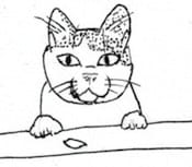
} Lookit my kitty
Lookit my kitty
Lookit my kitty, isn't he so very handsome?
Lookit my kitty
Lookit my kitty
Lookit my kitty
This example uses a very simple flex-wrap and flex-basis combination to get a series of small items that wrap according to the screen width but do not resize. All the other CSS properties are basic things to center the text, the image, and make sure the image doesn't overflow the box it's in.
Once it's working as you want it to, you can set your border and background colours, sizes and margins, to suit your site.
I recommend making small files, cropped and/or resized to something similar to the width of the gallery items, to speed up page loading for your visitors. You can link these thumbnails to a larger or full size version, or use a lightbox image viewer script, to properly show off the full image.
Don't forget to set the alt text! Screenreader users like to hear a description of your photo or art if they're browsing your gallery.
Responsive column layout
Give your home page a sidebar that gets out of the way on smaller screens!
<div class="flex-container">
	<div class="flex-main">
		whatever content and HTML tags you want in the main body of your page
	</div>
	<div class="flex-sidebar>
		whatever sidebar stuff you want
	</div>
</div>.flex-container {
display: flex;
flex-wrap: wrap;
flex-direction: row;
}
.flex-main {
flex-basis: 20em;
flex-grow: 5;
padding: 3px;
}
.flex-sidebar {
flex-basis: 10em;
flex-grow: 1;
padding: 3px;
}This is the main content for your home page.
Put as many paragraphs, headers, images, etc. in this div as you want.

Because why not have images of cats everywhere, right?
This is the sidebar.
Good for navigation links and other ancillary information.
This example uses different flex-basis and flex-grow properties for each column, leading to a sidebar that grows but much more slowly than the main content. It also uses flex-wrap so that the basis then becomes the minimum size the columns can be before they wrap and the sidebar is pushed below the main content.
If you want the sidebar on the left instead of the right, use flex-direction: row-reverse instead of putting the sidebar code above the main content code in your source. Because a sidebar is ancillary information, it should come after the main information for somebody using a screen reader. (Also, changing row to row-reverse and vice versa is a lot easier than moving the entire sidebar, if you change your mind about which side the sidebar belongs on.)
Other resources
CSS Tricks has a very comprehensive guide to flexbox, covering everything instead of just the introductory stuff here.
Flexbox Froggy: alignment exercises for flexbox, presented as a cute game.