Byline is a text typeface designed with an ethos of beauty and reliability. Drawing inspiration from Plantin, it maintains the beauty of Renaissance letters with the robustness of early 20th century newspaper types without becoming a pastiche of either.
When finding the proper DNA of what would become Byline, I knew that the typeface must be practical, first and foremost. After sketching three different styles that could serve the Good Internet magazine, I was told that the one inspired by Plantin would work the best for the purposes of the magazine. The initial sketch was very much a direct revival of the letterforms of Plantin. However, these replicas did not make it past the sketching stage: rather than trying to copy Plantin, I tried to capture its spirit.
The “spirit of Plantin” can best be described as a mixture of grace and robustness. These qualities are exemplified by a few key characteristics of Byline.
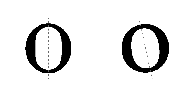
The stress of Byline is oblique. This maintains the tradition of old-style typefaces while also minimizing the “dazzle” from “picket-fencing.”
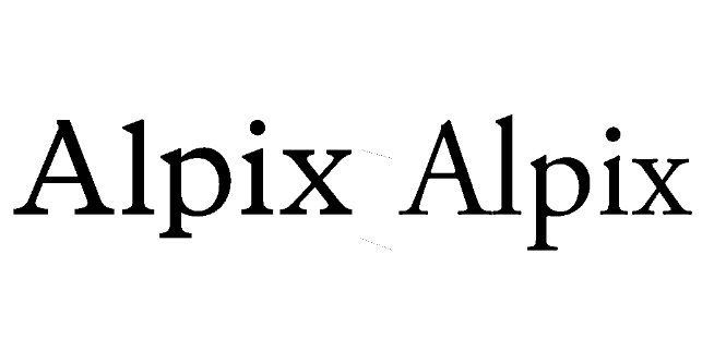
The x-height is generously large. Whereas the oblique stress was a hallmark of old-style typefaces, the large x-height of Byline comes from research into legibility, especially at small sizes and adverse printing conditions. Outside of the x-height, the descenders stay even with the cap line and the descenders are quite short, allowing for tight leading.
The stroke contrast of Byline is relatively low for a serif typeface, but this has the benefit of making sure that hairlines don’t disappear at small sizes and also giving it a weightier impression on the page, a look that fits well with the idea of a sturdy typeface.
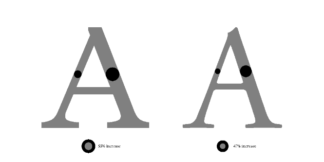

Serifs and terminals are comfortably large, making sure they don’t disappear at small sizes. While many old-style typefaces suffer from a general frailty, Byline goes in the opposite direction: a self-assured boldness in minor details.
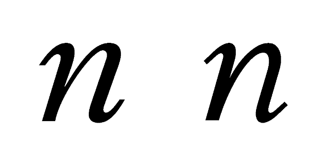
The italics in the original Plantin are notoriously fickle. In order to maintain the mood of Plantin, the italics required a great deal of simplifying and solidifying. The entry and exit strokes are changed from calligraphic swoops to straight lines joined with a simple curve.
In nearly all forms of visual design, typography is paramount (though I may be biased). Fonts are the main carrier of linguistic information, and, as such, must be carefully attuned to what information is being conveyed. The truth is that no font is perfectly suited to every message.
The same applies to web design. Just because everyone else uses [insert popular font here] doesn’t mean you have to: there is an abundance of well made fonts out there, if only you know where to look. If you want open-source typefaces, Google Fonts is a big one, but there are also smaller foundries with more focused catalogues such as Velvetyne and The League of Moveable Type. Additionally, there are collection of open source typefaces such as Use & Modify and Badass Libre Fonts by Womxn. Adobe Fonts offers a lot of fonts and is something of a “next-step” after open-source fonts. However, many of the best fonts are sold by independent type foundries. Type Foundry Directory is a relatively comprehensive list of most of them.
If, however, you are nonplussed by these myriad options of fonts, commissioning a custom typeface is a very good move: it lets you get exactly what you want and makes sure the font suits your technical needs. Most foundries offer custom font services. There are two main options one can take: either edit an existing font (typically the foundries own) or to create an entirely new typeface from scratch. Depending on what you want, both of those can be great options.
If you want neither a custom typeface or a pre-existing typeface, you are always free to make your own. It is a long and arduous process to improve one’s skill at making typefaces, and what follows is a personal anecdote followed by a list of resources about type design.
The first time I realized that there were people who made fonts was when watching Jonathon Hoefler’s episode (S2E6) on the docuseries Abstract: The Art of Design. I remember that while trying to make my first font, I knew it was bad. As such, I decided to make it my goal to make a purposefully bad font. And from there I continued to make somewhat decreasingly sucky typefaces for a few years.
The biggest boon to my “type design journey” was finding TypeDrawers—a forum about all things type related. TypeDrawers is the descendent of Typophile, which is now defunct. While sometimes a bit curmudgeonly, TypeDrawers really does have some of the best information out there and, being a forum, the ability to ask your own questions.
For anyone learning type design, the following list of resources are invaluable:
- Type Design Resources
- Typography Guru's Online Typography Resources
- Rosalie Wagner's Type Links
- Awesome Typography (a bit more tech-focused, but some of these things are musts)
Some specific resources that are very helpful:
- Gunnlaugur SE Briem: Notes on type design: A great primer on how to actually make fonts. It is on the FontLab website, but can be used by anyone using any software.
- Diacritics Project (archived): A great resource on drawing diacritics
- Ohno Radio: James Edmondson’s great podcast wherein he talks with type designers.
- Klim Type Foundry’s blog: It is a great way to learn about how a type designer approaches fonts, as well as some other, more general, articles. Many type foundries have similarly great blogs, Klim’s is just my personal favorite.
Grant Bowers is a type designer creating custom and retail fonts from 6 to 6000pt.
Member comments